Nowra High School
Brand Identity
Building & Vehicle Signage
Creative Partner
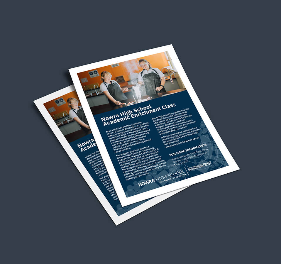
Flyer Design
Graphic Design
Logo Design
Photography & Video
It must be said the being tasked with rebranding a Shoalhaven cornerstone such as Nowra High School, is a highlight in our little Agency’s career to date.
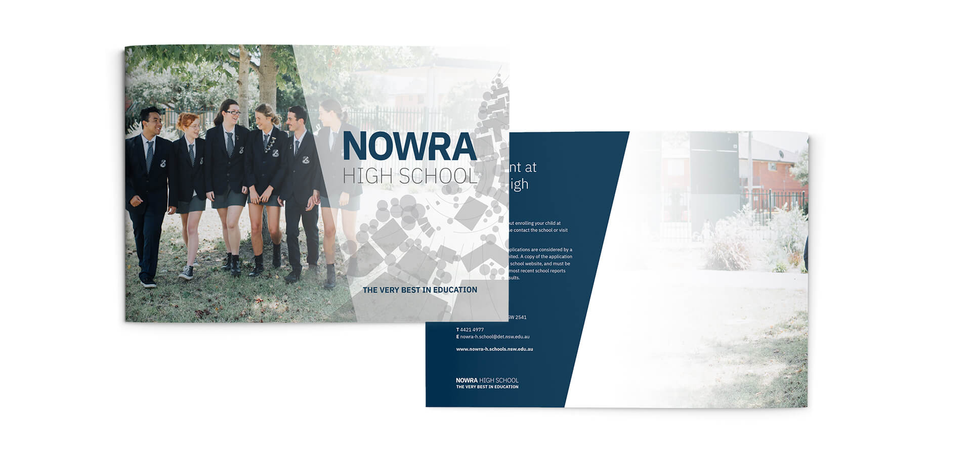
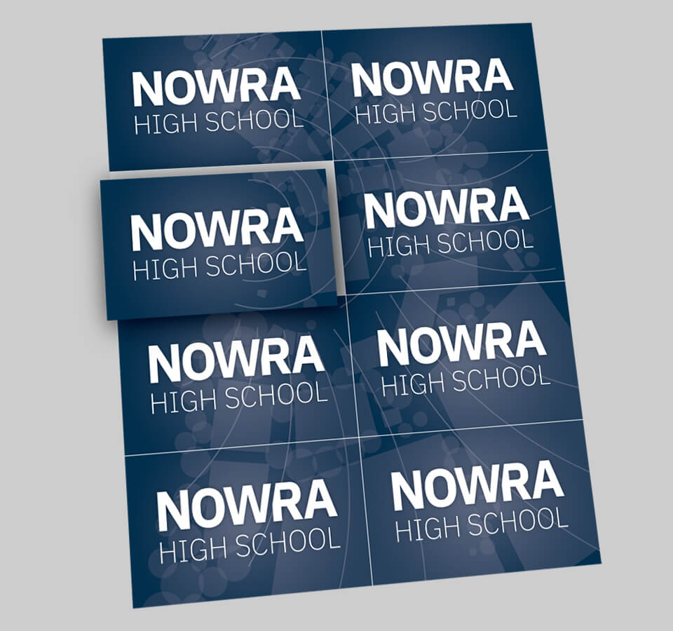
The school had been using a myriad of inconsistent crest logos and a very incohesive brand for years when they decided to get in touch. The brief was to formulate a brand for the school that was contemporary with a fundamental feel.
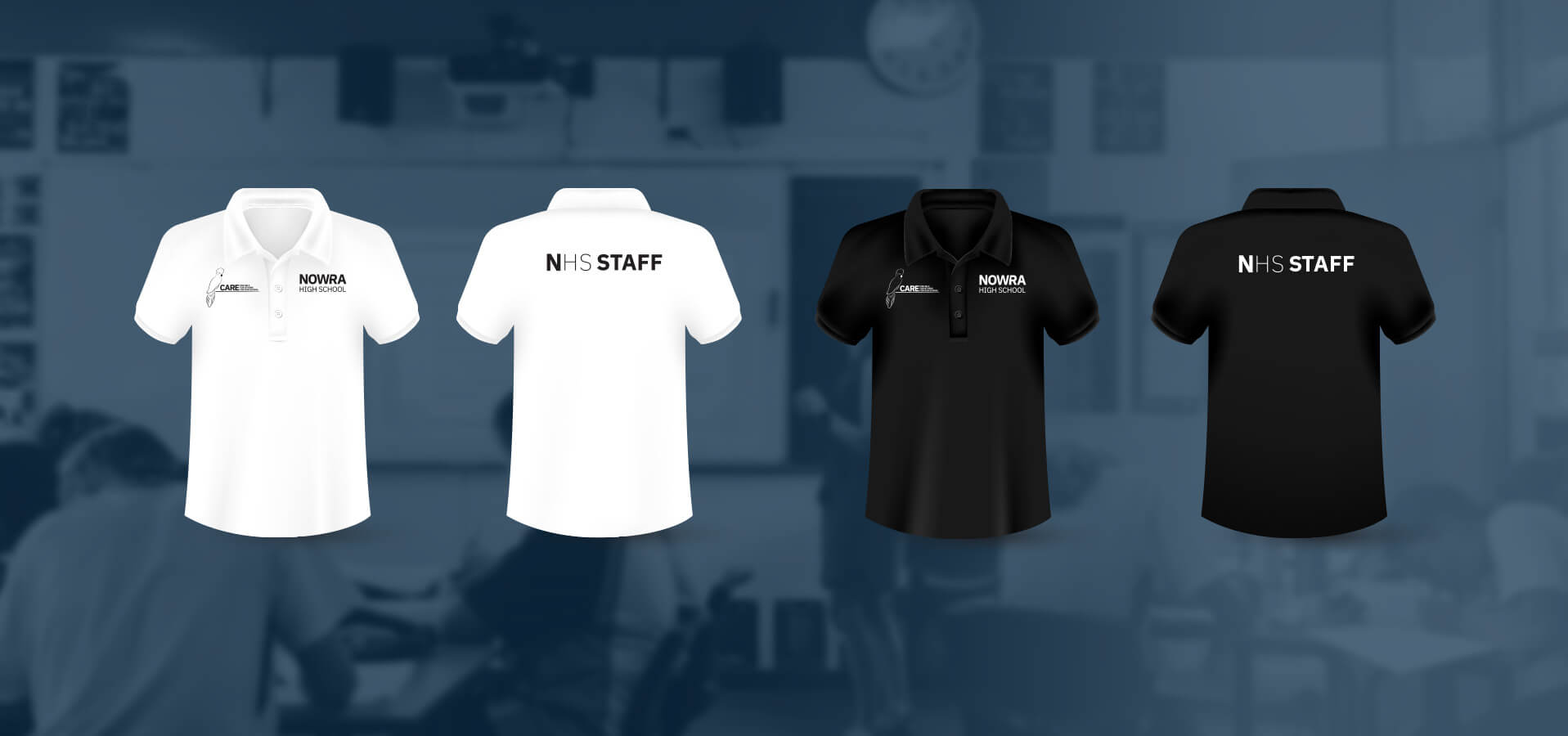
It was decided that a new typographic logo would need to be designed in parallel with modernising the existing crest logo for more formal applications. A typeface was chosen for the school, IBM Plex, a large family to suit the extensive applications the school would require.
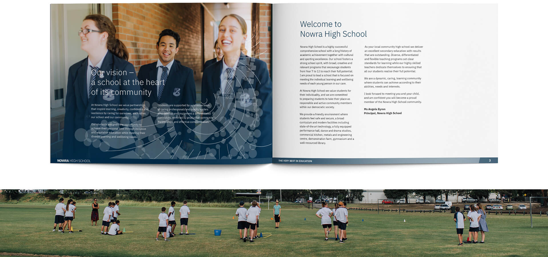
In addition, a hero pattern was developed drawing inspiration from a variety of areas.
Specifically, the school itself (birds-eye view) is seemingly growing from the centre and spiralling out. The shape itself is somewhat reminiscent of a bird in flight. A great metaphor for all things NHS, including; Self-esteem, personal growth, achievement and development. The fact that our design allows us to reflect the actual land in some manor is a welcomed bonus remaining respectful to the traditional landowners.
The illustrations execution is not bias in its appearance with imagery resembling that of Mathematical Fractal shapes, ‘Kandinsky’esk’ composition, Geographical accents, Scientific resemblance, Architectural styling and Cultural nods.
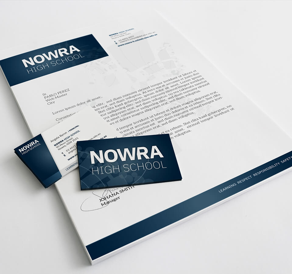
A complete corporate identity overhaul was carried out and a shared library of templates and resources given to the school for all faculty to use. Print management, signage design, Photography and typesetting were also undertaken as part of this huge opportunity.
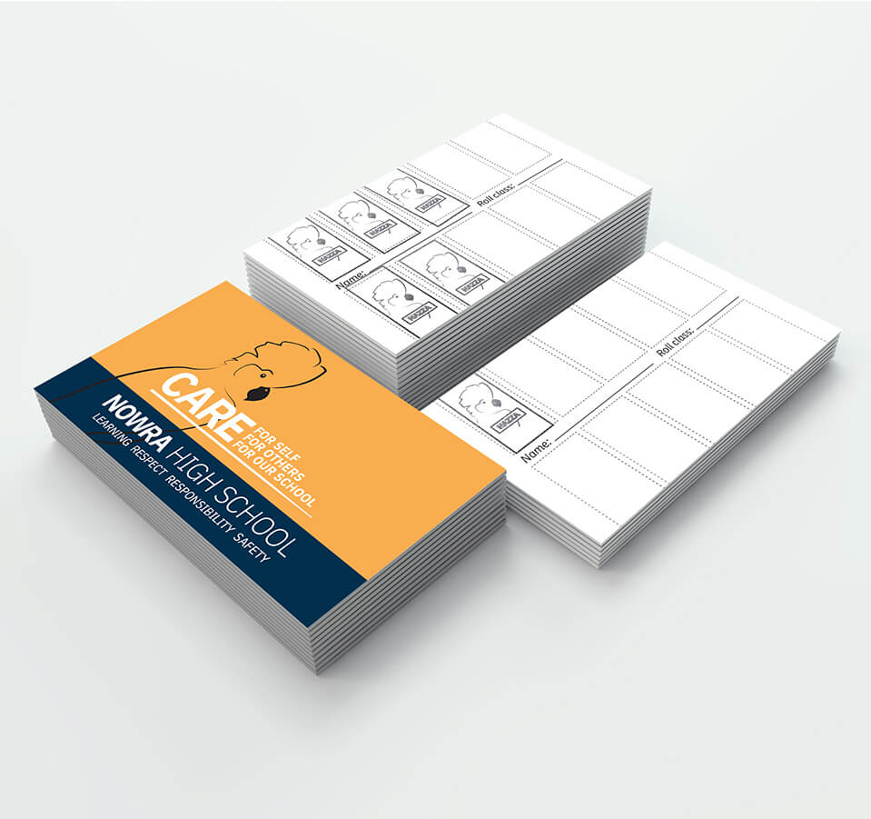
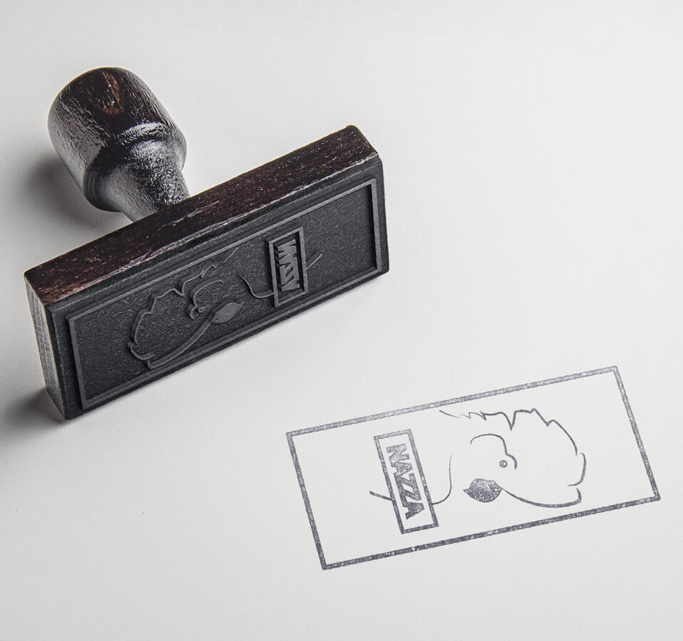
We were also tasked with the creation and implementation of the schools Best Practice campaign, bringing to life the school mascot “Nazza” and assisting with the reward system that is still used today.
Furthermore, we continue to maintain an effective working relationship with the school, maintaining the brand and providing print and design support.
